Page layout
Summary
Common markup to produce a standard page layout and base design.
This is an "outside-in" type of component aiming to provide a standardised page, intended for use with the full set of application header, navigation, page header, footer, etc. The content area has a preset layout system for common layout variations. There are several overall page layout options (full width, fixed width, etc).
Status
API status: | general |
---|---|
Web resource key: |
com.atlassian.auiplugin:aui-page-layout
|
AMD Module key: | N/A |
Experimental API: | 3.6 |
General API: | 5.1 |
Anatomy of a page
HTML document structure
AUI requires the following document structure:
<html lang="en">
<head>
<meta charset="utf-8"/>
<meta http-equiv="X-UA-Compatible" content="IE=EDGE">
<title><!-- Your page's title --></title>
</head>
<!-- All page variations are added to <body> -->
<body class="...">
<div id="page">
<!-- The page's structure is within this container -->
</div>
</body>
</html>
The #page container element is important to include. Some of AUI's components and behaviours will attempt to place content before or after this element.
Primary containers
The page is constructed of the following containers, each with a known ID:
<div id="page">
<header id="header" role="banner">
<!--
The #header container houses the product's application header.
It may optionally include any banner notifications. -->
</header>
<div id="content">
<!-- The #content container houses various page layout, navigation, and content patterns. -->
</div>
<footer id="footer" role="contentinfo">
<!-- The #footer should include content like the product name, version, support links, etc. -->
</footer>
</div>
The #content container is required, while the #header and #footer containers are optional.
Accessibility
Your page will consist of several landmarks. Users of assistive technologies, such as screen readers, can make use of these landmarks to quickly jump to different parts of your page, skipping across repeated, familiar, or less relevant content.
HTML5 element support
The HTML5 <header>, <footer>, and <main> elements have an implied role
that screen readers should capture. As at , our testing
indicates that some screen readers do not correctly expose these landmarks when using only the HTML5 element.
We recommend adding a "redundant" role attribute to each element that mirrors the semantic
of the HTML5 element. This provides the widest screen reader support.
Guarantee a <main> container
The most important landmark is the <main> element. There should only be one <main> element per page.
This landmark should be placed around what users would consider the page's "most important"
or "most unique" content.
A simple test for determining this would be to ask: "does this content appear on any other pages,
or only this one?" If it appears on only this page, it should be wrapped in <main>.
Otherwise, it may still be important enough to wrap in <main> —
ask "in most cases, would users want to quickly navigate to this content, or would they
want to skip past it?" If they would skip past it more times than not,
it's less likely the content should be wrapped in <main>.
Refer to the examples on this page to see where <main> is placed in common page layouts.
Name your landmark elements
Your page may have multiple tiers or hierarchies of landmark elements, such as multiple <nav>, <header> or <section> elements. Just as the purpose of these elements are represented in a visual hierarchy, their purposes need to be perceivable in non-visual contexts, too.
Screen readers use an aria-label
value placed on landmark elements to describe
the purpose of an element. Its value should be a translated, recognisable,
short name that gives context cues to screen reader users.
We recommend using the following names at specific hierarchy levels on your page:
- site
-
For the page's top-level #header container or the main navigational element
inside it (such as the application header).
Screen readers should announce this assite banner
if placed on <header> orsite navigation
if placed on <nav>. - sidebar
-
If your page includes a sidebar, use this for the <section> that houses it.
Screen readers should announce this assidebar region
. - page
-
For any <nav> element that either appears anywhere within the
.aui-page-panel container, or would change the content rendered inside
the <main> element.
Screen readers should announce these aspage navigation
.
You are encouraged to use domain-specific names for your navigation elements. For example:
-
In Confluence, the sidebar pattern's <nav> can be labelled "space",
as it only contains navigation items and actions related to Confluence's Spaces concept.
Screen readers should announce this landmark as "space navigation". - In Bamboo, a build results page is visually divided in to three regions: the page's header; a coloured bar containing the build result; and a page panel with fine-grained build details. Each region could be given a more friendly name, such as "build name", "build result", "build details".
Combining navigation patterns and main container
If your page includes navigation patterns, such as a sidebar or in-page vertical navigation, you must ensure the <main> element does not wrap these navigation patterns. You must place navigation patterns — such as sidebar or horizontal navigation — outside of, or adjacent to, the <main> element.
Variations
Page types
The page "type" affects how some sub-parts of the page's common structure are presented in a visual context.
The valid types are as follows:
Page type | CSS class (add to <body> ) |
Intended usage | Illustration of the effect |
---|---|---|---|
Fluid (full-width) Default | N/A | Use this layout for most pages. |
![]() |
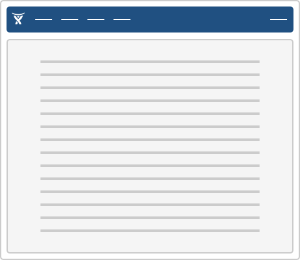
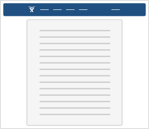
Fixed width | aui-page-fixed |
This layout reduces the amount of effort required to scan and read textual content. Best used on one-off pages with long passages of text, such as legal disclaimers, terms and conditions, or other documents. |
![]() |
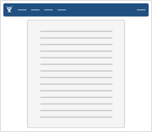
Hybrid width | aui-page-hybrid |
Use this layout to get the benefit of "Fixed width" legibility for long passages of text, but keep the application header's content positions consistent across other pages. |
![]() |
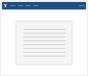
Focused task page | aui-page-focused |
Use this layout for every step in a logical flow the user should go through from start to finish, such as product setup pages, bulk changes to data, imports or exports, and other "wizard"-style processes. |
![]() |
Notification task | aui-page-notification |
The layout is similar to "Focused task", but has purpose-built extensions for rendering textual content.
Use this layout when there is exceptional information to present to the user, such as when a server error occurs, a page cannot be found, a system is down for maintenance, etc. |
![]() |
Page sizes
The focused and notification pages allow for adjusting the width of content by applying one of the following CSS
classes to the <body>
tag:
aui-page-size-small
aui-page-size-medium
aui-page-size-large
aui-page-size-xlarge
Default
Page content patterns
Within the #content container, you may place any of the following:
Pattern | Required markup structure inside #content |
---|---|
Sidebar |
<div id="content"> <div class="aui-sidebar"> <!-- The sidebar pattern and content goes here --> </div> <div class="aui-page-panel"> <div class="aui-page-panel-inner"> <main id="main" role="main" class="aui-page-panel-content"> <!-- Your page heading and content goes here --> </main> </div> </div> </div> |
Horizontal navigation above the standard page content layout. |
<div id="content"> <nav class="aui-navgroup aui-navgroup-horizontal"> <!-- The horizontal nav pattern --> </nav> <div class="aui-page-panel"> <div class="aui-page-panel-inner"> <main id="main" role="main" class="aui-page-panel-content"> <!-- Your page heading and content goes here --> </main> </div> </div> </div> |
Vertical navigation within the standard page content layout. |
<div id="content"> <div class="aui-page-panel"> <div class="aui-page-panel-inner"> <nav class="aui-page-panel-nav"> <div class="aui-navgroup aui-navgroup-vertical"> <!-- The vertical nav pattern --> </div> </nav> <main id="main" role="main" class="aui-page-panel-content"> <!-- Your page heading and content goes here --> </main> </div> </div> </div> |
Examples
Large focused page with horizontal navigation
<html lang="en">
<head>
<meta charset="utf-8"/>
<meta http-equiv="X-UA-Compatible" content="IE=EDGE">
<title>AUI - Default Page</title>
</head>
<!-- For a normal page, omit all 'aui-page-' classes on body -->
<body class="aui-page-focused aui-page-size-large">
<div id="page">
<header id="header" role="banner">
<!-- The skip links make it easier for keyboard-only users to jump to the crucial page content -->
<!-- Some of them may be optionally available for unauthenticated users... -->
<a class="aui-skip-link" href="https://example.com/log-in">Log in</a>
<!-- ...some are helpful anyway. -->
<a class="aui-skip-link" href="#main">Skip to main content</a>
<!-- Remember to translate all `aria-label` values!
Use the `aui.landmarks.site` i18n key here. -->
<nav class="aui-header aui-dropdown2-trigger-group" aria-label="site">
<div class="aui-header-inner">
<div class="aui-header-primary">
<span id="logo" class="aui-header-logo aui-header-logo-textonly">
<!-- Remember to translate all `aria-label` values!
Use the `aui.header.home.link` i18n key here. -->
<a href="https://example.com/" aria-label="Go to home page">
<span class="aui-header-logo-device">AUI</span>
</a>
</span>
<ul class="aui-nav">
<li><a href="https://example.com/">Nav</a></li>
</ul>
</div>
</div>
</nav>
</header>
<div id="content">
<div class="aui-page-header">
<div class="aui-page-header-inner">
<div class="aui-page-header-main">
<h1>Default page layout</h1>
</div>
</div>
</div>
<!-- Remember to translate all `aria-label` values!
Use the `aui.landmarks.main` i18n key here. -->
<nav class="aui-navgroup aui-navgroup-horizontal" aria-label="main">
<div class="aui-navgroup-inner">
<div class="aui-navgroup-primary">
<ul class="aui-nav">
<li><a href="https://example.com">Nav item</a></li>
</ul>
</div>
<div class="aui-navgroup-secondary">
<ul class="aui-nav">
<li><a href="https://example.com/">Nav item</a></li>
</ul>
</div>
</div>
</nav>
<div class="aui-page-panel">
<div class="aui-page-panel-inner">
<!-- The redundant `role` attribute is required for the VoiceOver + Safari combo -->
<main id="main" role="main" class="aui-page-panel-content">
<h2>Page content heading</h2>
<p>
Lorem ipsum dolor sit amet, consectetur adipiscing elit.
Phasellus vitae diam in arcu ultricies gravida sed sed nisl.
Curabitur nibh nulla, semper non pharetra eu, suscipit vitae eros.
Donec eget lectus elit. Etiam metus diam, adipiscing convallis
blandit sit amet, sollicitudin sit amet felis. Phasellus justo elit,
rhoncus sed tincidunt a, auctor sit amet turpis. Praesent turpis lectus,
aliquet vitae sollicitudin ac, convallis vitae urna. Donec consectetur
lacus a lacus tincidunt at varius felis venenatis. Pellentesque dapibus
mattis arcu, a vestibulum lacus congue at.
</p>
</main>
</div>
</div>
</div>
<footer id="footer" role="contentinfo">
<section class="footer-body">
<ul>
<li>I ♥ AUI</li>
</ul>
<div id="footer-logo"><a href="https://www.atlassian.com/" target="_blank">Atlassian</a></div>
</section>
</footer>
</div>
</body>
</html>
A page with sidebar
<html lang="en">
<head>
<meta charset="utf-8"/>
<meta http-equiv="X-UA-Compatible" content="IE=EDGE">
<title>AUI - Default Page</title>
</head>
<body>
<div id="page">
<header id="header" role="banner">
<!-- The skip links make it easier for keyboard-only users to jump to the crucial page content -->
<!-- Some of them may be optionally available for unauthenticated users... -->
<a class="aui-skip-link" href="https://example.com/log-in">Log in</a>
<!-- ...some are helpful anyway. -->
<a class="aui-skip-link" href="#main">Skip to main content</a>
<!-- Remember to translate all `aria-label` values!
Use the `aui.landmarks.site` i18n key here. -->
<nav class="aui-header aui-dropdown2-trigger-group" aria-label="site">
<div class="aui-header-inner">
<div class="aui-header-primary">
<span id="logo" class="aui-header-logo aui-header-logo-textonly">
<!-- Remember to translate all `aria-label` values!
Use the `aui.header.home.link` i18n key here. -->
<a href="https://example.com/" aria-label="Go to home page">
<span class="aui-header-logo-device">AUI</span>
</a>
</span>
<ul class="aui-nav">
<li><a href="https://example.com/">Nav</a></li>
</ul>
</div>
</div>
</nav>
</header>
<div id="content">
<!-- Remember to translate all `aria-label` values!
Use the `aui.landmarks.sidebar` i18n key here. -->
<section class="aui-sidebar" aria-label="sidebar">
<!-- Your sidebar markup goes here ;) -->
</section>
<!-- The redundant `role` attribute is required for the VoiceOver + Safari combo -->
<main role="main" id="main">
<div class="aui-page-header">
<div class="aui-page-header-inner">
<div class="aui-page-header-main">
<h1>A page with a sidebar</h1>
</div>
</div>
</div>
<div class="aui-page-panel">
<div class="aui-page-panel-inner">
<section class="aui-page-panel-content">
<h2>Page content heading</h2>
<p>
Lorem ipsum dolor sit amet, consectetur adipiscing elit.
Phasellus vitae diam in arcu ultricies gravida sed sed nisl.
Curabitur nibh nulla, semper non pharetra eu, suscipit vitae eros.
Donec eget lectus elit. Etiam metus diam, adipiscing convallis
blandit sit amet, sollicitudin sit amet felis. Phasellus justo elit,
rhoncus sed tincidunt a, auctor sit amet turpis. Praesent turpis lectus,
aliquet vitae sollicitudin ac, convallis vitae urna. Donec consectetur
lacus a lacus tincidunt at varius felis venenatis. Pellentesque dapibus
mattis arcu, a vestibulum lacus congue at.
</p>
</section>
</div>
</div>
</main>
</div>
<footer id="footer" role="contentinfo">
<section class="footer-body">
<ul>
<li>I ♥ AUI</li>
</ul>
<div id="footer-logo"><a href="https://www.atlassian.com/" target="_blank">Atlassian</a></div>
</section>
</footer>
</div>
</body>
</html>
An admin page (multiple tiers of navigation)
<html lang="en">
<head>
<meta charset="utf-8"/>
<meta http-equiv="X-UA-Compatible" content="IE=EDGE">
<title>AUI - Default Page</title>
</head>
<body>
<div id="page">
<header id="header" role="banner">
<!-- The skip links make it easier for keyboard-only users to jump to the crucial page content -->
<!-- Some of them may be optionally available for unauthenticated users... -->
<a class="aui-skip-link" href="https://example.com/log-in">Log in</a>
<!-- ...some are helpful anyway. -->
<a class="aui-skip-link" href="#main">Skip to main content</a>
<!-- Remember to translate all `aria-label` values!
Use the `aui.landmarks.site` i18n key here. -->
<nav class="aui-header aui-dropdown2-trigger-group" aria-label="site">
<div class="aui-header-inner">
<div class="aui-header-primary">
<span id="logo" class="aui-header-logo aui-header-logo-textonly">
<!-- Remember to translate all `aria-label` values!
Use the `aui.header.home.link` i18n key here. -->
<a href="https://example.com/" aria-label="Go to home page">
<span class="aui-header-logo-device">AUI</span>
</a>
</span>
<ul class="aui-nav">
<li><a href="https://example.com/">Nav</a></li>
</ul>
</div>
</div>
</nav>
</header>
<div id="content">
<!-- Remember to translate all `aria-label` values!
Use the `aui.landmarks.sidebar` i18n key here. -->
<section class="aui-sidebar" aria-label="sidebar">
<!-- Your sidebar markup goes here ;) -->
</section>
<!-- You may choose to label this element according to your information hierarchy. -->
<section>
<div class="aui-page-header">
<div class="aui-page-header-inner">
<div class="aui-page-header-main">
<h1>Admin section</h1>
</div>
<div class="aui-page-header-actions">
<div class="aui-buttons">
<button type="button" class="aui-button">
Do a thing here
</button>
</div>
</div>
</div>
</div>
<!-- You may add a horizontal navigation pattern here ;)
Be sure to label it with the same label as the parent section element has. -->
<div class="aui-page-panel">
<div class="aui-page-panel-inner">
<div class="aui-page-panel-nav">
<!-- Remember to translate all `aria-label` values!
Consider using the `aui.landmarks.page` i18n key here. -->
<nav class="aui-navgroup aui-navgroup-vertical" aria-label="page">
<!-- Your in-page navigation content goes here. -->
</nav>
</div>
<!-- The redundant `role` attribute is required for the VoiceOver + Safari combo -->
<main id="main" role="main" class="aui-page-panel-content">
<h2>Page content heading</h2>
<p>
Lorem ipsum dolor sit amet, consectetur adipiscing elit.
Phasellus vitae diam in arcu ultricies gravida sed sed nisl.
Curabitur nibh nulla, semper non pharetra eu, suscipit vitae eros.
Donec eget lectus elit. Etiam metus diam, adipiscing convallis
blandit sit amet, sollicitudin sit amet felis. Phasellus justo elit,
rhoncus sed tincidunt a, auctor sit amet turpis. Praesent turpis lectus,
aliquet vitae sollicitudin ac, convallis vitae urna. Donec consectetur
lacus a lacus tincidunt at varius felis venenatis. Pellentesque dapibus
mattis arcu, a vestibulum lacus congue at.
</p>
</main>
<aside class="aui-page-panel-sidebar">
<h2>Explanation of the page</h2>
<p>
Docs, tips, tutorials, steps, or other helpful text can go here.
</p>
</aside>
</div>
</div>
</section>
</div>
<footer id="footer" role="contentinfo">
<section class="footer-body">
<ul>
<li>I ♥ AUI</li>
</ul>
<div id="footer-logo"><a href="https://www.atlassian.com/" target="_blank">Atlassian</a></div>
</section>
</footer>
</div>
</body>
</html>
Notification page for system status
See the System notification page for this example.
Code
Soy
To construct a full document with soy, you need to call document
and page
templates.
{template .index}
{call aui.page.document}
{param windowTitle: 'Window title text' /}
{param headContent}
<!-- HEAD content such as CSS and JS resources -->
{/param}
{param content}
{call aui.page.page}
{param headerContent}
<!-- call aui.page.header here -->
{/param}
{param contentContent}
<!-- call aui.page.pagePanel here -->
{/param}
{param footerContent}
<!-- literal content here -->
{/param}
{/call}
{/param}
{/call}
{/template}
To set the page layout in Soy, use the pageType param:
@param? pageType Default: default (full width).
Options: default, focused, notification, fixed, hybrid, generic (no class applied).
If you need a small focused page, you can set the size with pageSize. focusedPageSize as been deprecated:
@param? pageSize Default: xlarge.
Options: small, medium, large, xlarge.