Dark mode
Summary
Design tokens are used for all Atlassian products. AUI is built on them and thus bundles them.
They are recommended for reuse to match the products in custom and third-party component libraries, but we recommend using AUI variables in code tightly related to AUI components.
The set of design tokens will evolve with time and are updated in AUI to provide as much forward compatibility as possible.
Status
| API status: | general |
|---|---|
| Web resource key: |
com.atlassian.auiplugin:aui-design-tokens-api
|
| AMD Module key: | N/A |
| Experimental API: | 9.7 |
| General API: | 10 |
Initialization
1. Load the design tokens API
There are two entry points available: one with a minimal API purely to enable a theme, and the other with the full API (e.g. tracking when theme changes using ThemeObserver). You only need to load one of them.
To load the minimal API, use one of:
- Using AUI from WRM - include the
com.atlassian.auiplugin:design-tokens-apiweb-resource - Using AUI from NPM - include the
aui-prototyping-design-tokens-api.jsfile
To load the full API, use one of:
- Using AUI from WRM - include the
com.atlassian.auiplugin:design-tokens-api-fullweb-resource - Using AUI from NPM - include the
aui-prototyping-design-tokens-api-full.jsfile
After the API has loaded, these functions are on the AJS.DesignTokens global variable:
- in the minimal API -
setGlobalTheme() token()getTokenValue()ThemeMutationObserver
See the design tokens API documentation for reference.
2. Load the tokens
From AUI version 10.0 this is done automatically given the CSS reset is loaded on the page.
To load just the tokens without the rest of AUI, use the com.atlassian.auiplugin:aui-design-tokens-base-themes-css web-resource.
Be careful to avoid loading both as it will lead to double-loading.
3. Avoiding flashes
Ensure the com.atlassian.auiplugin:aui-reset web-resource is loaded before first paint.
Apps may provide a custom theme and the design token setGlobalTheme() API loads themes asynchronously, so it's important those are also loaded before first paint.
Tokens compatibility layer
In version 1.0.0 of the design tokens library, several token variables reached their end of life and were deleted.
However, these are still available for maximum cross-compatibility with Atlassian Design System components by depending on the com.atlassian.auiplugin:aui-design-tokens-compatibility-themes web-resource.
For app engineers
If your app uses @atlaskit/tokens version 0.3.0 or below, we strongly suggest you upgrade.
The naming convention changed to include the --ds- prefix and the compatibility layer supports only the new naming convention.
If your app uses @atlaskit/tokens below 1.0.0 but above 0.3.0, you should still consider upgrading.
However, if your app runs in the context of a product that includes AUI, then the obsolete variables will resolve to their modern equivalents when using the compatibility layer.
For product engineers
Actively remove any need for the compatibility layer in order to reduce bundle size. There are other benefits to upgrading Atlassian Design System components too including the usual a11y, security, and bug fixes.Using tokens
All colours should be based on design tokens.
If there are custom or hardcoded colors in your code, you should replace them with semantically appropriate design tokens. See the reference documentation for what is appropriate.
It's easy to forget colors often lurk in:
- images
- canvases
- colors received from server
Helpful adoption tools
Design Token codemods
A codemod is provided which will automatically replace most of the colors. The replacements are not precise and require manual review, but are a good starting point.
Testing theme
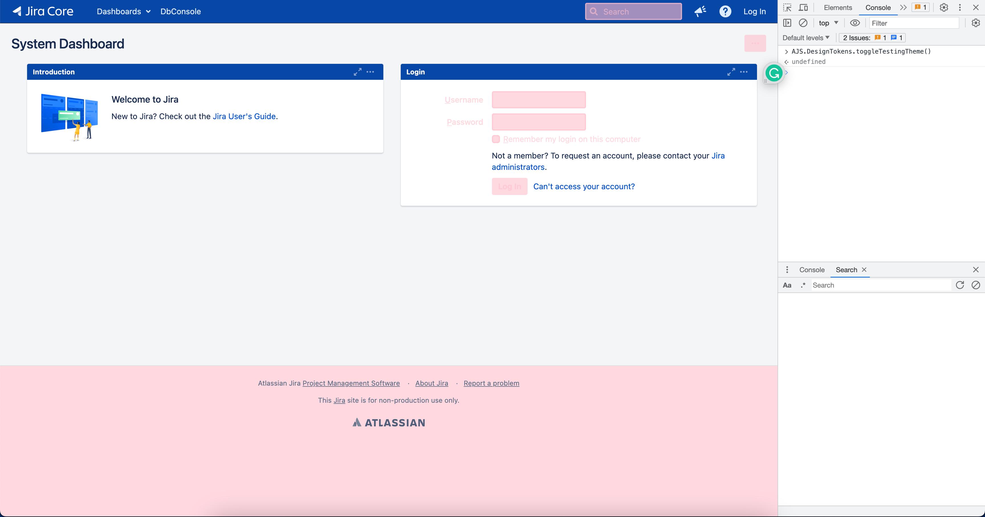
Even after manual review and lint rules it's easy to miss unconverted colors. To help with this, AUI includes a testing theme to help visually find errors. It sets everything to a single (visually distinct) color and anything that sticks out needs to be converted.
You can access it through these functions:
enableTestingTheme()disableTestingTheme()toggleTestingTheme(stateBoolean)setTestingThemeColor(cssColorString)- to override default color by passing a custom color value or reset to default if nothing is passed
Here is an example of what it looks like in Jira Data Center on the system dashboard page before Jira supported dark mode (everything in pink was already using design token):