Dark mode
Summary
There is a library for colors in all Atlassian products - Design Tokens. It's bundled into AUI and components can be switched to use color tokens provided from there.
Our vision
Our plan is that Design Tokens library will evolve and provide more themes and maintain colors (including contrast). We are going to update version of library that is bundled with AUI and make sure all AUI variables are correctly mapped to Design Tokens.
We expect that AUI users will use both AUI variables and Design Tokens in their code.
We recommend using AUI variables in UI parts that are tightly related to AUI components or custom extensions over AUI components.
Our approach is that we don't wrap or change Design Tokens library API in any way, since:
- Library already has maintained documentation, we don't want to complicate it by creating additional source of truth
- Usage should also be concentrated in single location for easier maintenance and not be accessed in many places, so complexity is less important.
At the same time, we bundle Design Tokens library in AUI to simplify and unify consumption for products, additionally allowing ourselves to provide extensions on top (like testing theme or automation).
Status
| API status: | experimental |
|---|---|
| Web resource key: |
com.atlassian.auiplugin:aui-design-tokens-api
|
| AMD Module key: | N/A |
| Experimental API: | 9.7 |
Setup (for product developers)
1. Enable Design Tokens in AUI
For this you need to load Design Tokens in your frontend:
- if you use WRM -
com.atlassian.auiplugin:design-tokens-apiresource should be included where other auiplugin things are included. - if you use NPM -
aui-prototyping-design-tokens-api.jsentry should be included where the mainaui-prototyping.jsis included.
After resources are loaded, you should be able to access Design Tokens API functions under AJS.DesignTokens.
Currently, we re-expose these functions:
setGlobalTheme()token()themeObjectToString()themeStringToObject()getTokenValue()
You can find description of how they should be used in Design Tokens API doc.
2. Preload Design Token themes packed with AUI on initial page load (optional)
This is still in development and will be released in separate AUI release.
We plan to extract Design Token themes into static CSS files that will be provided as web-resources (or files in case of NPM package).
This will allow easy pre-loading of CSS themes in DC-friendly way, fixing white flash on page load.
3. Activate Design Tokens theme using API
This is done by simply calling setGlobalTheme() on client-side. This function will check if theme is loaded,
and load it if not, then activate chosen theme in application. For more details, please refer to Design Tokens
documentation linked in step 1.
If you followed step 2 to pre-load themes, setGlobalTheme() will detect it and enable them right away.
setGlobalTheme() function is the tool to control which theme is active at the moment, and it's up to you decided
when it will be executed. However, we recommend it to use it together with ahead-of-time loading from step 2 and
call function for the first time before DOMContentLoaded to avoid white flash.
Also it's up to product to implement UI for switching themes on demand and store currently selected option. Please, consider the case of plugin developers using this function to switch theme in application. Maybe you'll need to wrap it additionally to track theme switch attempts.
4. Switch AUI themes to use Design Tokens
To do this put aui-theme-design-tokens class on body element. Now all AUI variables will change values to use Design Tokens.
Make sure to remove all other theme related classes.
By enabling design tokens theme you tell AUI that you would like to switch on using Design Tokens as main source of colors and will control themes through Design Tokens library API.
Congratulations! Now you should have tokens available on your page.
Using tokens (for product and plugin developers)
The goal is that all colors in your application are switched when setGlobalTheme() is called.
If some colors are hardcoded in your code, you should replace them with semantically appropriate Design Tokens. You can see all available tokens on Design Token list.
Keep in mind edge cases:
- images
- canvases
- colors received from server
Tools that can accelerate you
Design Token codemods
Design Tokens provide automated codemods script which you can execute to automatically replace most of the colors. Those replacements still can be not precise and require manual overview, but can speed you up a lot.
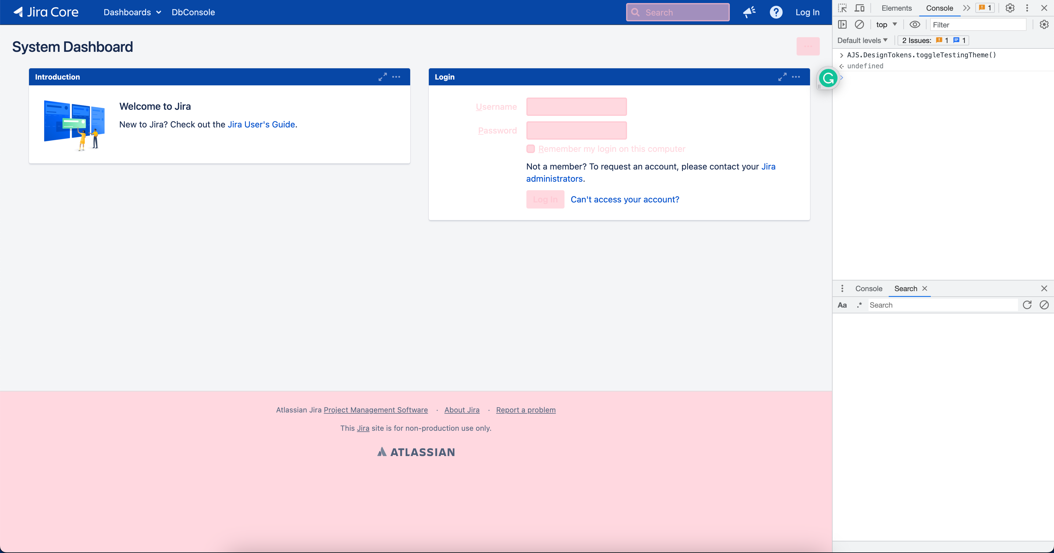
Testing theme
Even after manual overview you can find yourself not sure if all colors 100% on a page use Design Tokens.
For that we introduced testing theme that is incorporated into AUI and can help you visually find inconsistencies on the page.
The idea is simple - all Design tokens will be switched to use one color, and anything that doesn't use it will be easy to identify. You can also configure color yourself through API.
You can access it through these functions:
enableTestingTheme()disableTestingTheme()toggleTestingTheme(stateBoolean)- you can pass boolean to force specific statesetTestingThemeColor(cssColorString)- you can override default color by passing custom color value. Will reset to default if nothing is passed.
Here is an example of how it looks like in Jira Data Center dashboard before migrating any Jira colors (only AUI Design Tokens theme enabled):

Things highlighted with pink are using Design tokens correctly, everything else should is using custom / hardcoded colors and should be replaced.