Summary
current /ˈkɜr·ənt, ˈkʌr·ənt/
adjective (HAPPENING NOW) - of the present time or most recent
Whenever dealing with collections of items (i.e. lists, navigations), we may want to differentiate several items.
Those items may be considered as active, selected or otherwise highlighted due to user’s action or location.
Common patterns
There are plenty of common patterns where a thing in a groupFootnote [1] may be considered as selectedFootnote [2]. To name few:
- The current page/link in a navigation block
- The current time in a timetable/schedule
- The current date in a calendar
- The selected dates (date range) in a calendar
- The active tab in a horizontal navigation block
- The selected options in an option list
Current vs selected
While being very similar in behaviour, current and selected items may carry different meanings and both can occur within the same set.
What's the difference then? Let's have a look on some examples:
In a navigation pattern current may be used to indicate which page is currently displayed (see: current page), while selected indicates which page will be displayed if the user activates the item.
Furthermore, the same navigation tree may support operating on one or more selected items, for instance by using context menu containing options such as "delete" and "move".
Similarly, in a calendar pattern current may be used to indicate the currently set system date, while selected indicates the date that will be used if the user activates the item.
Moreover, the same calendar may support specifying more than one selected date, thus specifying date ranges.
In principle
Behaviour
Current and Selected
Whether specifying current and/or selected elements, there are certain principles to follow:
The design has to guarantee that the items are distinguishable despite user' personal settings (think: font size, custom colour pallet, dark-mode, high-contrast mode etc…), color vision deficiencies or other vision impairment…
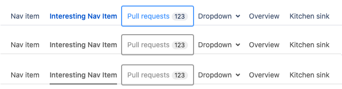
Regular user sees 3 types of items: regular (dark blue), current (lighter blue, bolded) and selected (lightest blue, framed).
User with Monochromacy sees 2 types of items: regular (grey), and selected (grey, framed). Current item looks like regular items.
User with Monochromacy + inclusive design = 3 types of items: regular (grey), current (grey, underlined), selected (grey, framed).
AUI provides aui-nav-selected classname in navigation-pattern components (see: navigation patterns).
Similar indicators may be provided for other, core components - always check component's documentation if adequate markup is available.
Applying visual styling will not accommodate users with significant vision impairment or total vision loss. We may need to provide alternative means to make this information available - depending on context, markup or components used.
There are several means to achieve that:
- Certain form components provide adequate information out of the box - by usage of
checkedorselectedattributes aria-selectedattribute may be added to other elements to explicitly state their role- Using assistive labels - not visible to sighted users but read by screan readers may also provide adequate contextual information
AUI provides globally available assistive classname (see: hidden assistive css) allowing for labeling information that's not visible to sighted users but is properly read aloud by assistive technologies.
Always include assistive label, unless component describes a preferred approach or provides a out-of-a-box solution, such as checked, selected or aria-selected attributes handled by the component.
Use natural language, appropriate in a given context, to provide adequate contextual information with the assistive label.
If your application allows user-selectable interface language - always provide translation for the label.
While we generally recommend sticking to consistent approach across your application - adding contextual, assistive label may require more flexible approach due to particular language constructs.
As the label is due to follow the natural language flow - there might be more tha one ways to apply it in a given context.
We generally follow the first presented approach in our examples, as - based on our experience - it is easier to handle when dealing with multi-language interfaces and translations.
Truth is, though - there exists no "best" way to approach this pattern.
Be aware of your target group, capabilities of your application and adjust according to own's needs.
Action may depend on current application's context:
In a calendar pattern selected and non-selected items may allow for toggling between their state - allowing to easily "select" or "unselect" item within the collection. Current item - indicating currently set system date - may behave in the same manner as other selected items, though it's initial state might be different (the calendar component opens with "current" date selected).
In a tabs pattern actioning on highlighted item may change the content of the landmark associated with the menu. It may also move the "current" marker onto the actioned item.
Actioning on current item may allow for easy move (content-jump) between the navigation menu and the landmark it controls by providing adequately targeted anchors.
With the exception of a few corner cases - both selected and current items have to be actionable. Their actions may, and in many cases - will be the same.
Examples:
Horizontal navigation
Requirements: current element targets a landmark containing side and/or partial information, not fulfilling requirements of current page
Notice: the current element has aui-nav-selected classname, provides adequate assistive label and is linked to an appropriate landmark
Tabs panel
Notice: the current element has aria-selected="true" and is linked to an appropriate landmark
Unique cases
Current page
By the current page we may understand an identifier such as url or name, that uniquely describes "where we are" within our application - similarly to "you are here" pointer on a map.
"Current page" should describe and/or identify the content of the <main> landmark rendered at a given time.
Always, when element of a set represents the current page, in navigation patterns or any other arbitrary collections
The location you'd be referring to is already rendered and is the main content of the page the user sees.
As it's not representing any specific content, any particular landmark within the page - there's nowhere "to go to".
This avoids misunderstandings and emphasises that the current list or menu item is active and represents the currently displayed content as a whole.
Example:
Breadcrumbs
Notice: the current page has aui-nav-selected classname, provides adequate assistive label, is not a link.
Vertical navigation
Notice: the current page has aui-nav-selected classname, provides adequate assistive label, is not a link.
Notice: due to unique styling of the component - additional span markup container is needed to encapsulate list's content for a non-interactive item.
Vertical navigation (antipattern)
Requirements: Due to business requirements current page has to be linked
Notice: it has aui-nav-selected classname, the anchored element has aria-current="page" attribute added and no assistive label is provided