Documentation
All-in
Avatars


Badges
Small pieces of extra information within components like Navigation, eg. a count:
Buttons
AUI Buttons cover combinations of free standing, grouped, disabled and toggled buttons:
Sets of grouped buttons can be contained in Toolbar2 for a complete toolbar.
Date Picker
A simple date picker polyfill for browsers that don't support date fields.
Dialogs
Dropdown2
Expander experimental api
Forms
Available in several flavours including compact top-label style, long-label and short-label:
Icons
For the full set of icons and sizes, refer to the docs.
Global vector icons:
Dev tools icons:
Editor icons:
JIRA icons:
Vector icons also available in large:
You should adjust the alternative text (the text inside the SPAN element) to suit the meaning and usability of your scenario. If you are using it in a button which has the button's action as visible text, you don't need to duplicate the text inside the icon too. However if you are creating an icon-only control, you should include the alternative text.
Inline dialog
If you don't need a full modal Dialog, you you can use an Inline Dialog.
Layout (Group + Item)
Borders and backgrounds added for demonstration purposes only - in production, no borders or backgrounds will be applied.
Evenly spaced item
Evenly spaced item
Evenly spaced item
Evenly spaced item
Split group - first item aligned left.
Split group - second item aligned right.
Trio group - first item aligned left.
Trio group - second item aligned centre.
Trio group - third item aligned right.
Keyboard shortcuts
WhenIType allows you to trigger various events based on keyboard input.
Type "z" then "e" to execute some simple JavaScript.
Labels
AUI provides a CSS-only Label component - each product's implementation is expected to be different, so no default JS is provided.
unclickableUncloseableclickableclosableNoUrlsplitLabel
Lozenges
Standard and Subtle variations:
default success error current new moved
default success error current new moved
Messages
Progress Tracker experimental api
- Step One
- Step Two
- Step Three
- Step Four
- Step Five
Navigation
AUI has a core set of navigation elements, which are most commonly used in horizontal and vertical navgroups.
Horizontal navigation
Should be placed immediately before .aui-page-panel
Vertical navigation
Usually placed inside an .aui-page-panel-nav but will expand horizontally to fit any appropriate container element.
Pagination navigation
Used to show links between paginated content:
Page
Page Layouts
The AUI Page component sets up the whole-page layout, with several options:
| Fluid (default) | Fixed | Hybrid | Focused Task |
|---|---|---|---|
 |  |  |  |
Content layouts
Within page layouts, there is a dedicated pattern for setting up the content's layout.
| Content Only | Nav + Content | Content + Sidebar | Nav + Content + Sidebar |
|---|---|---|---|
 | 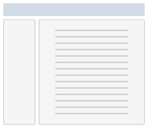 | 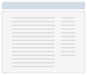 |  |
Page header
Page header with avatar, breadcrumbs and actions
Tabs
Horizontal tabs
Tab 1
Quidquid latine dictum sit, altum viditur. Sentio aliquos togatos contra me conspirare.
Quidquid latine dictum sit, altum viditur. Sentio aliquos togatos contra me conspirare.
Tab 2
Quidquid latine dictum sit, altum viditur. Sentio aliquos togatos contra me conspirare.
Quidquid latine dictum sit, altum viditur. Sentio aliquos togatos contra me conspirare.
Tab 3
Quidquid latine dictum sit, altum viditur. Sentio aliquos togatos contra me conspirare.
Quidquid latine dictum sit, altum viditur. Sentio aliquos togatos contra me conspirare.
Vertical tabs
Tab 1
Quidquid latine dictum sit, altum viditur. Sentio aliquos togatos contra me conspirare.
Quidquid latine dictum sit, altum viditur. Sentio aliquos togatos contra me conspirare.
Tab 2
Quidquid latine dictum sit, altum viditur. Sentio aliquos togatos contra me conspirare.
Quidquid latine dictum sit, altum viditur. Sentio aliquos togatos contra me conspirare.
Tab 3
Quidquid latine dictum sit, altum viditur. Sentio aliquos togatos contra me conspirare.
Quidquid latine dictum sit, altum viditur. Sentio aliquos togatos contra me conspirare.
Tables
Just add class="aui" to your tables (for tabular data, never layout!). Follow correct structure - include THEAD and TBODY, use TH for headers and TD for body:
| Ship name | Nickname | Type | Misadventure |
|---|---|---|---|
| Red Dwarf | The Crimson Short One | JMC mining vessel | Duplicated, shrunk, lost, found, rebuilt by nanobots. |
| Starbug | The Bug | JMC transport shuttle | Crashed multiple times, shot at, sunk. |
| Nova 5 | Not known | Coca-Cola marketing vessel | Crashed with soapy mainframe. |
Sortable tables experimental api
You can make AUI tables sortable according to their header row. Columns can be set to unsortable, or sort by special cases such as Issue Keys:
| Key | Issue Name | Watchers | Description |
|---|---|---|---|
| KAR-1123 | Cannot sort tables | 2 | Table sorting should be allowed |
| KAR-87 | Issue Page doesn't load in IE | 0 | When loading issue page on IE it doesn't show |
| KAR-1133 | Program crashes on opening | 3 | When opening JIRA it crashses |
| KAR-4 | Vending Machine is empty | 9001 | NO SOFT DRINK! |
| BAT-4 | Computer is dead | 1 | Work computer is not turning on |
| BAT-11 | Workers are being too loud | 10 | The people around me are too loud |
| BATA-8 | Lift door sometimes doesn't open | 16 | When trying to enter the lift, the doors do not open |
| BATA-14 | Coffee machine is needed | 501 | Coffee is needed |